TravelPlus: Building a multi-product design system
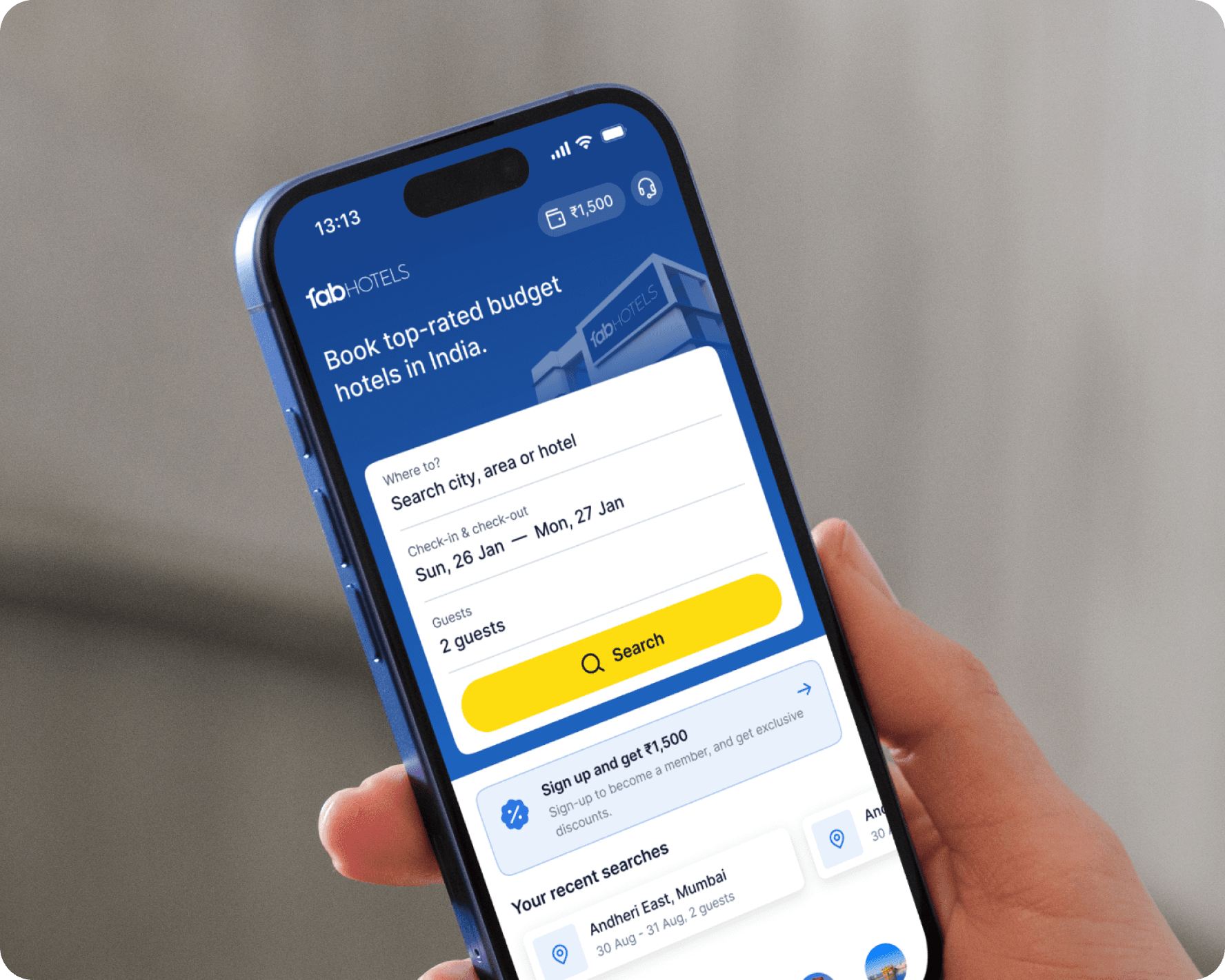
TravelPlus is a corporate travel and expense management platform, co-founded by Vaibhav Aggarwal, who also co-founded FabHotels. I first started working with Vaibhav on TravelPlus. Noticing the poor design choices in both TravelPlus and FabHotels, along with the tech team’s scattered efforts, I proposed building a unified design system to streamline design and development. Today, I lead design for both these products.
Drag the handle to see before vs after
The outcome
30%
Faster development cycles
15+
Engineers rely on the design system daily
65%
Fewer design related bugs reported by QA
2
The approach
Even after setting up a design system in Figma for TravelPlus, things weren’t as seamless as expected. Inconsistencies crept in during development, and making design changes often led to unforeseen challenges. That’s when Storybook came in. It allowed us to refine and test components in isolation, before they made their way into production.
Once we gained confidence, we extended the design system to the more sensitive product — FabHotels.

Design System approach
But... will both products look same?
Not quite. While both TravelPlus and FabHotels share the same design foundation & DNA, they each have their own identity. The design system provides consistency in components, but it also allows for flexibility—colors, and tweaks that can be adapted to match each brand’s unique personality.
A controversial opinion I believe in "Creativity flourishes within constraints." The right set of constraints frees us to focus on crafting experiences that are both innovative and perfectly tailored to a brand’s needs.

Left: TravelPlus. Right: FabHotels.
Creating the perfect button component
I finally figured out the ultimate way to build a button component—one that is scalable, flexible, and easy to maintain. No more chaos and lag.
The solution lies in a layered architecture:
1. Base component
A foundational layer that defines core properties such as size, structure, and icon support. This ensures uniform spacing, padding, and alignment across all variations.
2. Variant layer
This layer introduces hierarchies to the base button (Featured, Primary, Secondary, Tertiary, etc) and interaction states for each (Default, Hover, Pressed, Focused, Disabled, Loading).

A sleek button component

Some more building blocks
Designing for scale
When designing the flight booking page, the goal was to ensure clarity or usability was not compromised for different travel scenarios— whether it’s a non-stop flight, multi-stop journey, round trip. The key was component-driven approach— breaking the layout into modular blocks.

Scalable states for a flight booking
Data, designed right
Each chart was designed to present key information upfront, with clear hierarchy, subtle interactions, and consistent styling—making insights easy to consume at a glance.

Snippets of charts
Policy-driven flexibility
Every company operates differently - The goal was to build a product that’s flexible enough to adapt to these organization-specific expense policies.

Example of a data table UI